A synthesis of computer science and environmental science tackling climate change visualization.
This project visualizes the intersection of climate change and wildfire trends in California and Georgia by combining environmental data with geospatial mapping, and full-stack web development. It uses NASA MODIS indices, NOAA climate data, and Google Earth Engine to build a live dashboard that allows users to explore regional temperature, drought severity, and fire frequency over time. Through dynamic graphing and data storytelling, the project highlights how computer science empowers environmental research by making complex ecological patterns understandable and actionable.
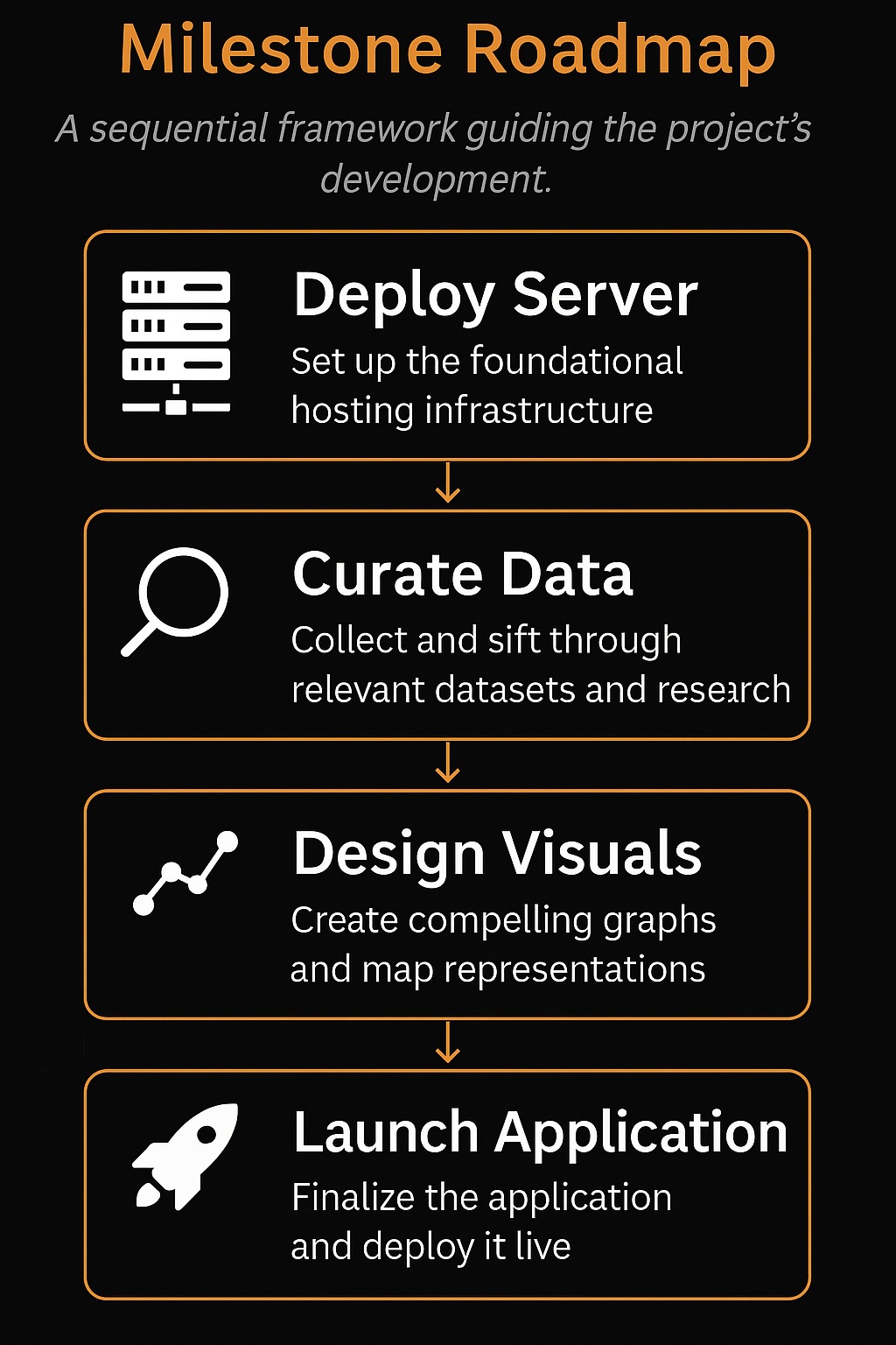
Project Roadmap
A journey from planning to full deployment through structured milestones.
Milestone 1: Define project scope and goals
Milestone 2: Set up server infrastructure and file structure
Milestone 3: Collect, clean, and prepare data sources
Milestone 5: Integrate machine learning and dynamic visualizations
Milestone 6: Finalize dashboard features, deploy publicly, and present findings
Behind the Scenes
Technologies, data processing, and design strategies powering the dashboard.
The project was built with Python (Dash, Flask, Pandas), Folium for mapping, Plotly for interactive visualizations, Google Earth Engine for satellite data, and Heroku for deployment. Custom callbacks, dynamic filtering to ensure the user experience remains both responsive and scientifically grounded.
Python
HTML/CSS
Plotly
Pandas
Heroku
Flask
Folium
NumPy
Key Findings
Major discoveries through data exploration.
- California and Georgia saw rising average annual temperatures over the period 1980–2022.
- Drought severity showed strong correlations with fire frequency, especially during prolonged dry periods.
- Vegetation health indices like NDVI declined in regions experiencing recurring wildfire events.
Data Sources
Reliable data powering the dashboard and insights.
NASA MODIS
Google Earth Engine (GEE)
NOAA Climate Data
Key Papers
Influential research guiding project methodology and analysis.
Hernandez, K., & Hoskins, A.B. (2024).
Machine learning algorithms applied to wildfire data in California's central valley.Trees, Forests and People, 15, 100516.
This study explores machine learning models like decision trees and random forests to predict wildfire risks in California, using climate data and fire history to map fire-prone zones with improved accuracy.
Giglio, L., Boschetti, L., Roy, D.P., Humber, M.L., & Justice, C.O. (2018).
The Collection 6 MODIS burned area mapping algorithm and product.Remote Sensing of Environment, 217, 72–85.
This paper details enhancements in the MODIS Collection 6 satellite algorithm that detects and maps burned areas globally, offering improved spatial accuracy and reliability for fire detection via remote sensing.
Abatzoglou, J.T., & Williams, A.P. (2016).
Impact of anthropogenic climate change on wildfire across western US forests.Proceedings of the National Academy of Sciences, 113(42), 11770–11775.
This landmark paper quantifies the influence of human-driven climate change on wildfires, showing that about half the increase in wildfire activity since 1984 is linked to warming and drying caused by emissions.
Future Directions
Exploring next steps in climate-tech applications.
Building upon this dashboard, future versions can integrate machine learning prediction models to forecast wildfire outbreaks and monitor biodiversity changes over time using real-time satellite inputs. Expanding regional interactivity, users could toggle between ecological zones and compare projected impacts of droughts, temperature shifts, or vegetation loss. Ideas include:
🔥 Predicting fire-prone regions based on past fire events and climate conditions
🌱 Monitoring biodiversity shifts using satellite and field-observed species data
🛰️ Pulling live NDVI and EVI feeds to display current vegetation health on the map
📈 Developing anomaly detection for abrupt ecosystem changes via time-series forecasting
📍Adding interactive choropleth maps with ecological layer toggles
Quick Start: Creating a Plotly Graph
Build your first interactive graph in just a few lines of code.
Plotly makes it easy to create interactive, publication-quality graphs with minimal code. Here's how you can quickly generate a simple line chart:
import plotly.express as px
import pandas as pd

# Sample data
df = pd.DataFrame({
    'Year': [2020, 2021, 2022, 2023],
    'Value': [10, 15, 13, 17]
})

# Create a line chart
fig = px.line(df, x='Year', y='Value', title='Simple Line Chart')

# Show the graph
fig.show()